Asset usage
Usage allows you to know which of your data assets are the most used. It represents the number of queries in the last 7 days for datasets and number of views for dashboards.
The usage is displayed in the tapper on top of every asset page. Assets are categorized in tiers according to their usage. Tiers are computed for each datasource. By default, the tiers are:
- Low: Less than 70th percentile
- Medium: Between the 70th and the 95th percentile
- High: More than 95th percentile
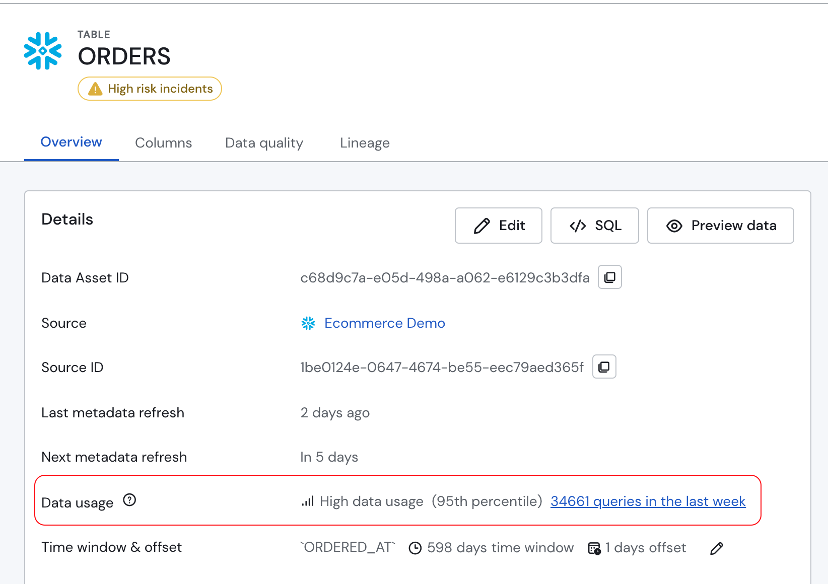
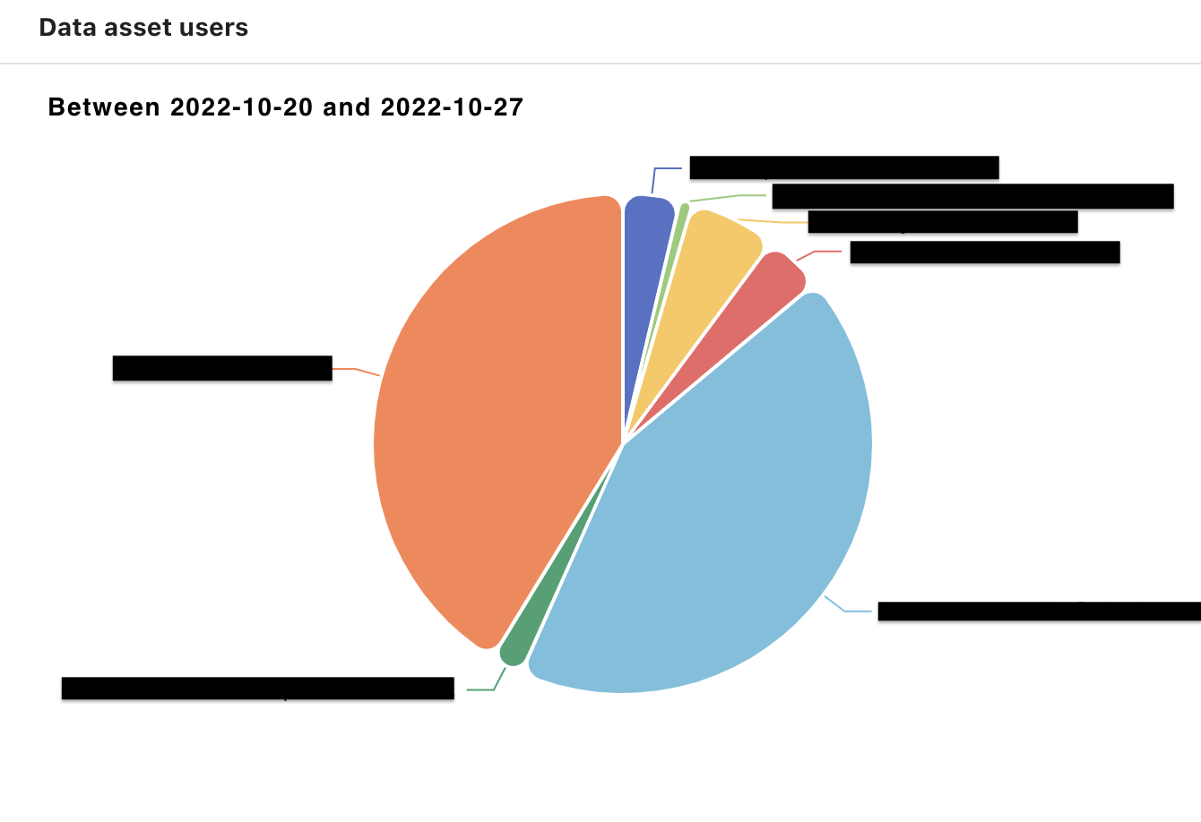
When clicking the number of queries, a pie chart will be displayed, representing the number of queries per user.
Usage is available for the following assets (and will be extended to additional asset types in the future):
- BigQuery
- Snowflake
- Tableau
Updated 8 months ago
Did this page help you?