New: Notification Rules
by Gabriela RomeroWe’ve introduced Notification Rules, a new way to manage alerts and incident routing across monitors from one centralized location. Instead of configuring notifications monitor by monitor, you can now create reusable rules that apply to multiple assets or monitors at once.
What’s New
Notification Rules let you define what triggers alerts (matching monitors/assets) and where those alerts are sent.
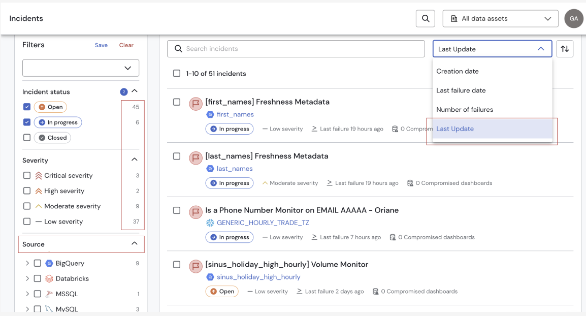
- Automatic Incident Creation : When a monitor fails and matches a Notification Rule, a Sifflet Incident is automatically created by default.
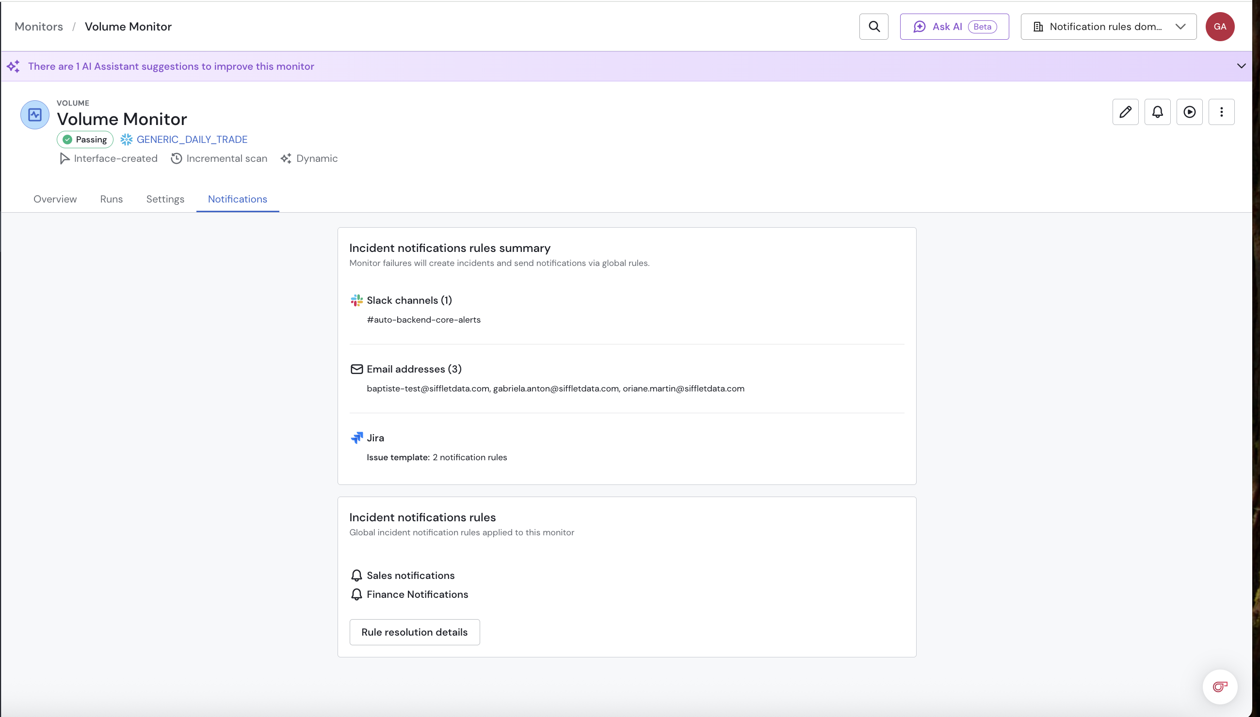
- Monitor Inheritance: New monitors now automatically inherit matching Notification Rules, reducing manual setup during monitor creation.
- Override for Specific Monitors: Users can override inherited rules on individual monitors when custom notification behavior is needed.
- Improved Visibility: Users can now view applied Notification Rules directly in Monitor Overview and Incident Overview
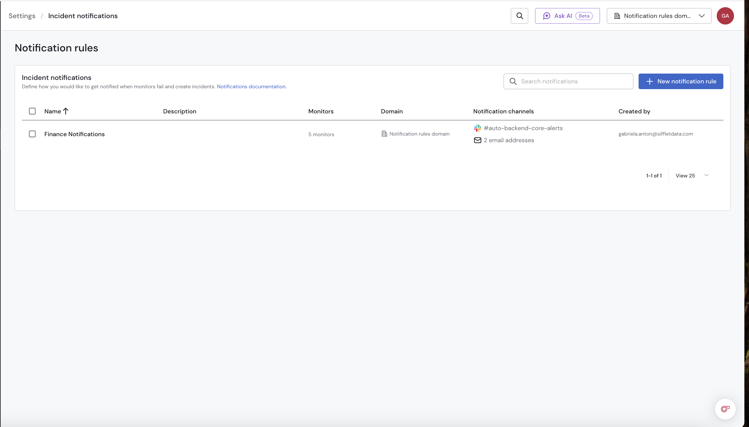
Example:
You manage the Sales domain and want to monitor payment tables.
You create a rule for payment_transactions, invoices, and refunds, focusing on Freshness and Volume.
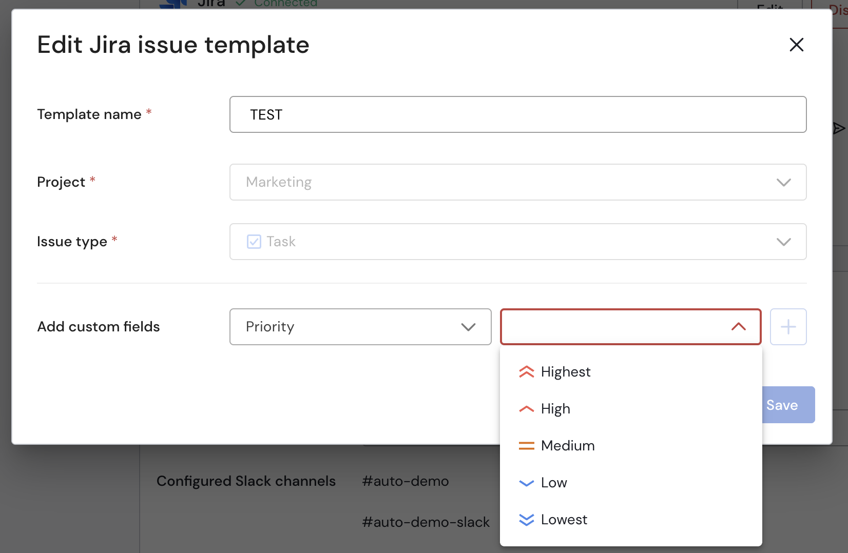
Now, whenever an issue occurs, alerts are automatically sent to #finance-alerts, finance-ops@company , and Jira using the FINOPS template, so your team can react quickly and avoid impacting financial reporting.
Why It Matters
Notification Rules make alerting in Sifflet more scalable, consistent, and easier to maintain ,while helping teams respond faster to incidents.
Learn more about it here.
v659

